COLOR TRENDS AT FERIA HÁBITAT 2026: A WORLD OF COLOR
After two days exploring the latest color trends at Feria Hábitat this year, exploring more furniture, fabrics and decor than I could possibly remember, talking with exhibitors and taking far too many photos, I left feeling inspired by everything I'd seen and learned.
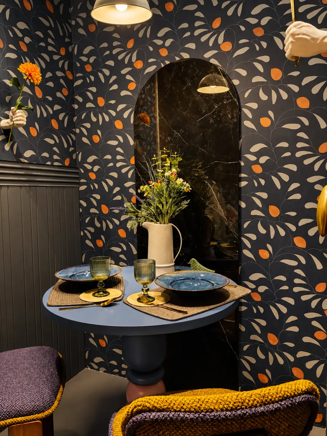
When I started going through my photos and thinking back on everything I’d seen, it became pretty clear that when it comes to color, there weren’t many big surprises this year.
We’ve been seeing many of these colors for a few years now, and they’re obviously not going anywhere. What I found interesting was how they were being used, the combinations, and the different moods they created.
EARTHY COLORS ARE STILL EVERYWHERE
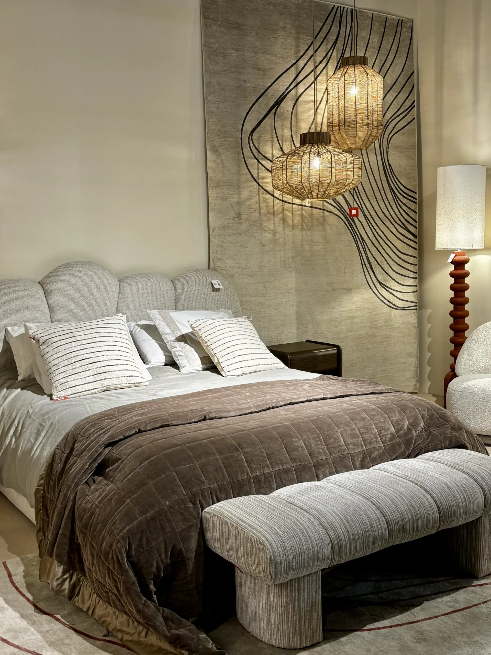
No surprises here. Terracotta, rust, ochre, browns, olive green and all those colors inspired by nature are still present.
They’re easy to live with, work beautifully with natural materials and bring warmth to a room without being too bold.
What I notice, though, was a move toward deeper browns. Dark wood tones appeared alongside the lighter beiges we’ve become used to seeing. I love warm palettes, but I think a little depth makes a nice difference.
MORE COLOR, PLEASE!
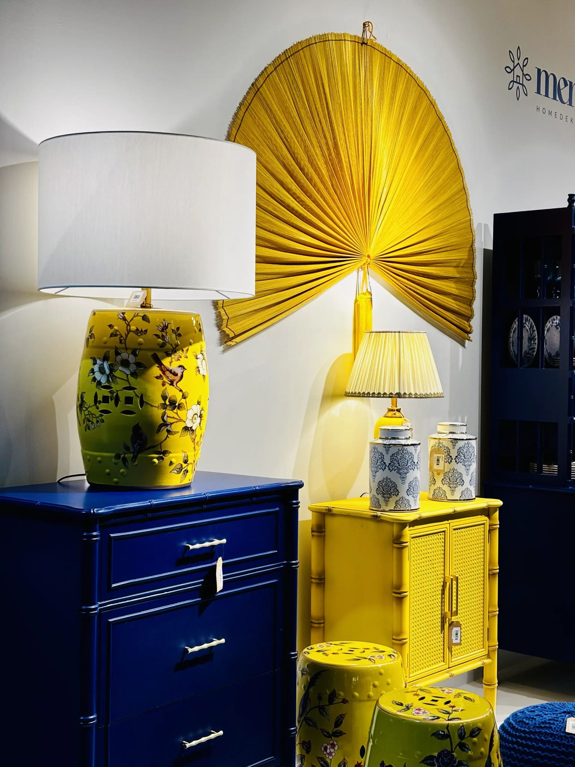
I’m happy to say the fair wasn’t all about neutrals. There were plenty of reds, yellows, blues, greens and pinks, sometimes used individually and sometimes mixed together in combinations that immediately caught my eye. Bold colors aren’t a new trend, but it’s always nice to see manufacturers and designers experimenting with them. I loved seeing furniture and lighting in strong colors, especially pieces that became the focal point of the entire display.
I noticed that the most colorful stands are always the ones attracting the biggest crowds and getting photographed the most. I think that says a lot about how much people love color. No matter how popular neutrals are, we’re still drawn to it.
70s INSPIRED COLOR PALETTES
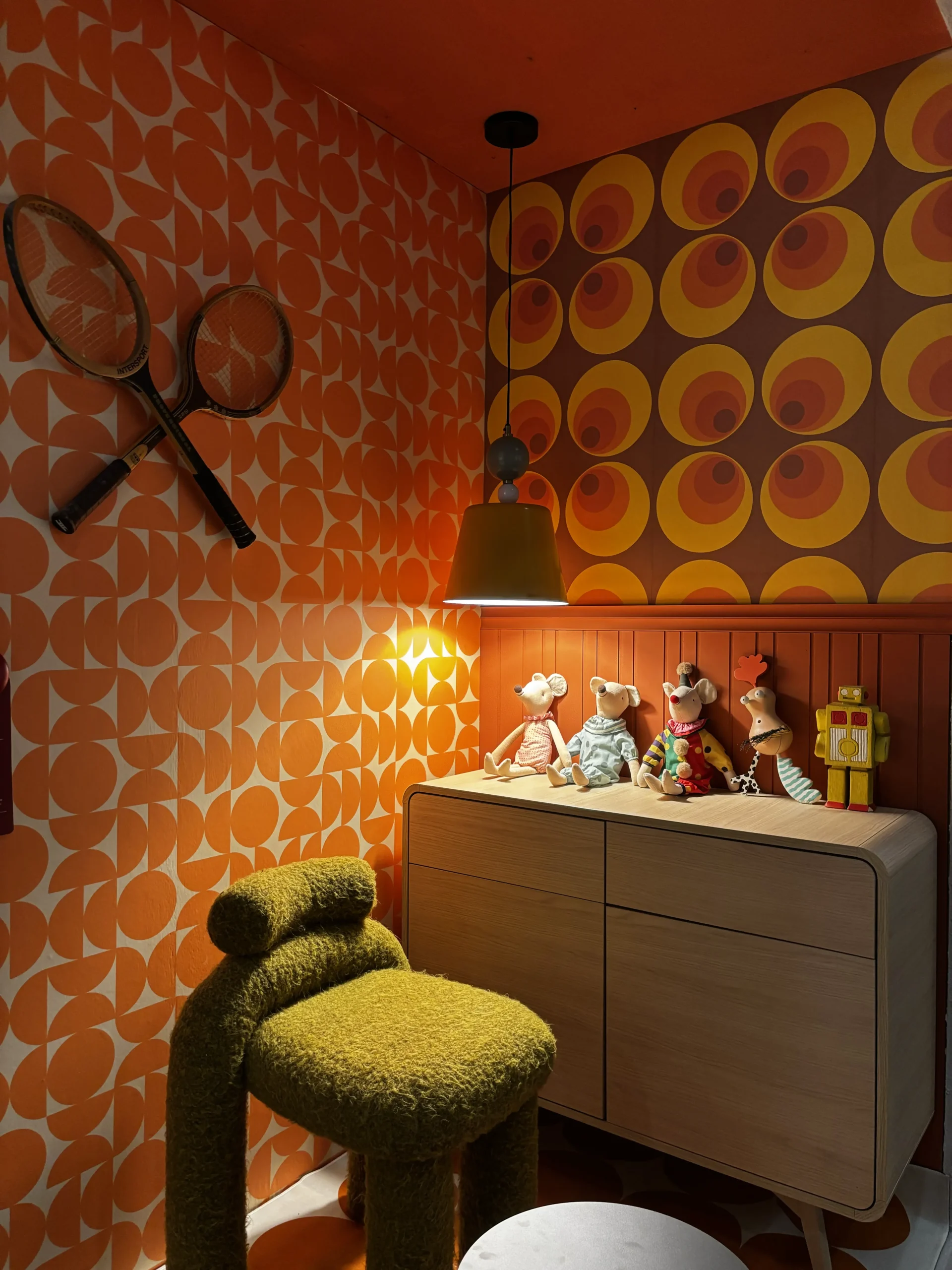
One thing that felt new this year was the stronger influence of the 70s. It’s been gaining popularity over the past few years and I noticed it more at Feria Hábitat this year. The colors were just as retro as the furniture.
Mustard yellow, burnt orange, warm browns and olive greens appeared alongside retro patterns, bold wallpaper, rounded furniture and vintage inspired decorative accessories.
What I like about this direction is that color is not used in isolation, it’s part of the whole look, working together with the shapes, patterns and materials.
And we can recreate a little of that 70s atmosphere without turning our homes into a time capsule, just a few colors, patterns or decorative pieces can be enough.
A MIX OF COLOR AND PATTERNS
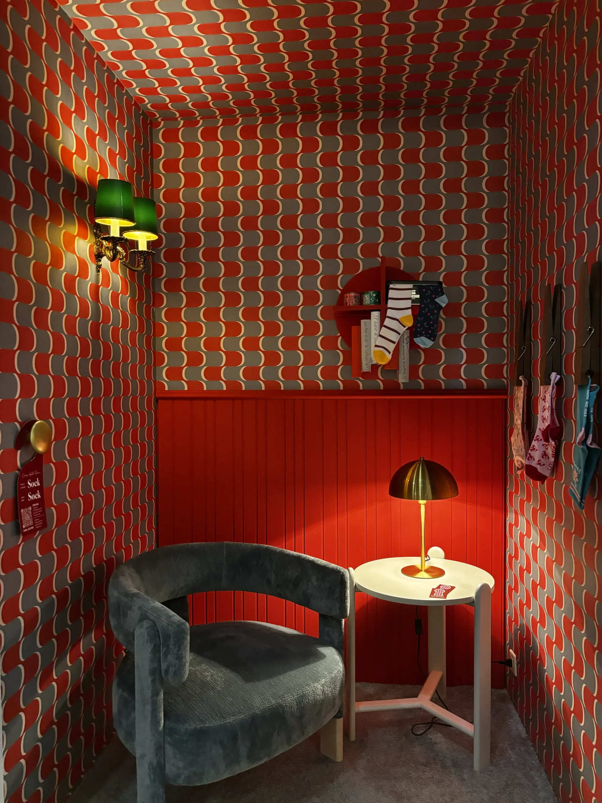
Another thing that caught my attention was how confidently some brands were using pattern. Stripes, geometric designs and colorful wallpapers were throughout the fair, including spaces where the pattern continued up onto the ceiling.
More than anything, I liked seeing different colors and patterns brought together without having to match. Of course, that doesn’t mean we should all start covering our walls and ceilings in bold wallpaper. But there’s refreshing seeing interiors that aren’t afraid to have a little fun.
SOFT COLORS AND PASTELS
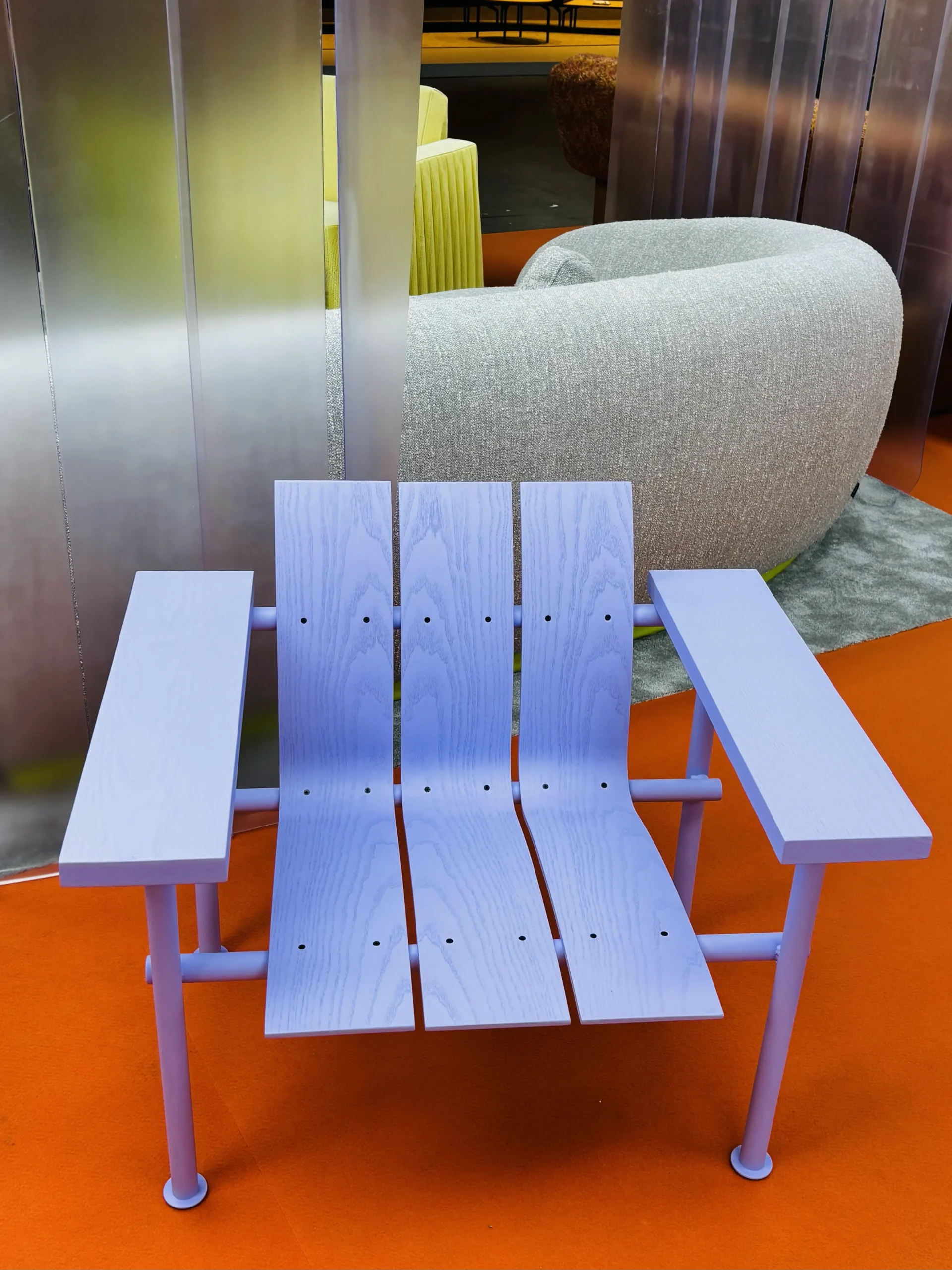
Bold colors weren’t the only ones that got my attention. There were also softer shades, including pale greens, lavender, pinks and other pastels that brought a completely different feel.
I like how these colors introduce color without making a room feel busy, especially when they are paired with warm wood, natural fabrics or darker accents.
They prove that using color doesn’t always mean choosing something bright or dramatic. There’s plenty of room between an all beige interior and a bright yellow sofa.
A FEW FINAL THOUGHTS
If I had to sum up the color trends at Feria Hábitat this year, I’d say we’re seeing more of what we already know, with a few interesting variations. Earthy colors are still going strong, browns are getting deeper, the 70s influence is becoming more noticeable, and there’s still plenty of room for bold, playful combinations.
What I always enjoy about fairs like this is seeing how designers and brands put their own spin on familiar ideas. Even when the colors themselves aren’t new, there’s still plenty of creativity in how they’re brought together.
With love for design,
Ana


